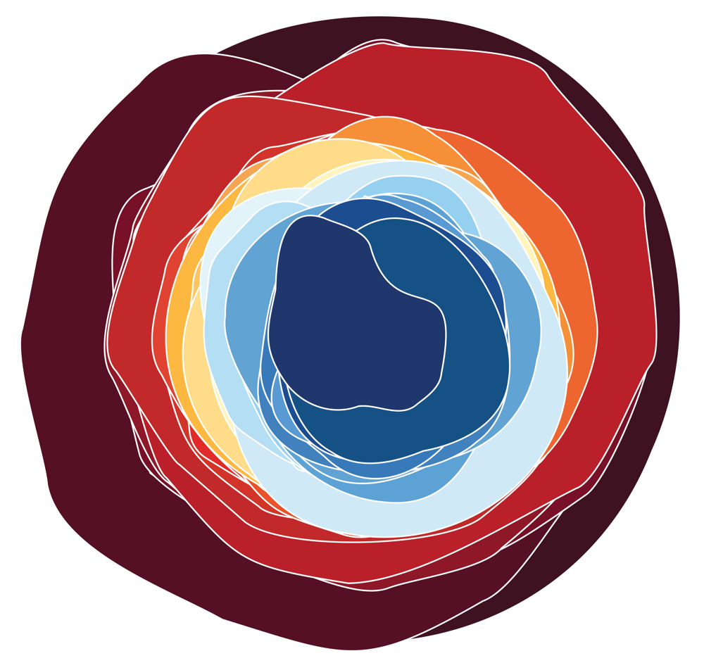
Data visualizations are commonly used to inform people about climate data. This talk explores the intersection of functional art and data visualization, where the goal shifts from informing an audience to encouraging action and climate conversations. I crafted linocut postcards that feature a data visualization about energy demand. Linocutting, a printmaking technique, gives the postcard a handmade and tactile quality. The form of the postcard becomes a piece of functional art that can be sent to a friend or a policymaker. The postcards feature a visualization about how US data centers are projected to double their energy consumption by 2030. US data centers are currently the subject of policy debates over how to regulate their development and energy use. Communities can send these postcards to contact representatives about their concerns and support for climate policies. The data visualization linocut postcards combine an element of art, a logical appeal of data, and an inherent function of communication. Together, they make it easier for constituents to turn their support for sustainability into climate action. In this talk, I show the process of the visualization design and linocutting, discuss the challenges of the project, and reflect on data visualization goals to inspire action.