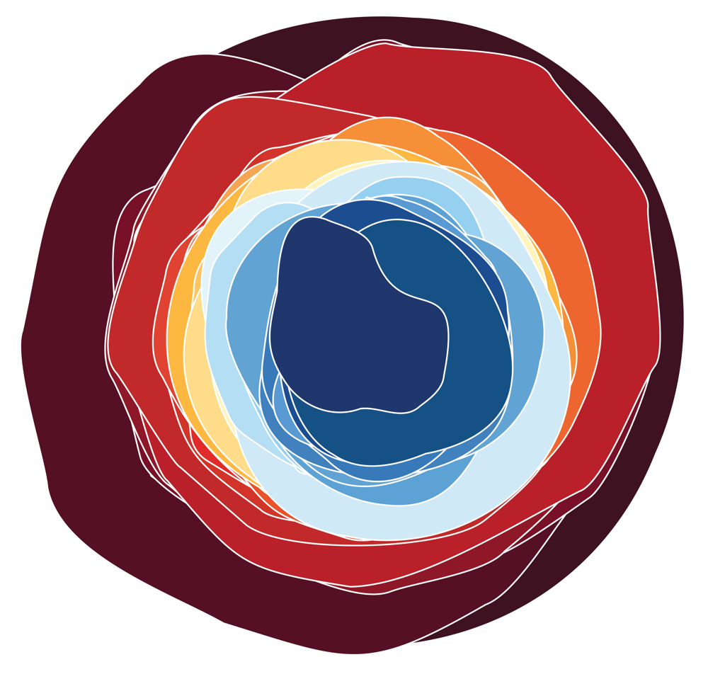
Europe is experiencing increasingly frequent and severe extreme weather events. To improve public awareness of climate change, effective tools for communicating and visualising these phenomena are essential.
This workshop introduces the European Extreme Events Climate Index (E3CI), a new index designed to measure extreme events and track long-term climate trends. The E3CI combines seven climate hazard components - heat waves and cold waves, drought, heavy precipitation, wind, hail, and forest fires - into standardised monthly indicators based on Copernicus ERA5 reanalysis data, referenced against a 1981–2010 baseline.
It is accessible via the Data Station (https://datastation.climateindex.eu/), an interactive platform that lets users explore data at national, regional, and provincial levels, helping to understand patterns and trends without technical expertise.
During this 90-minute hands-on workshop, participants will be guided in understanding an extreme weather event and how it is measured through the E3CI. They will learn how to interpret the Index components, and work with open climate datasets. Through guided exercises (e.g., Jupyter notebooks), attendees will explore real case studies of recent extreme events across Europe, comparing climate trends over time and discovering how visual design choices shape the perception and understanding of the climate situation.
Based on their outputs, participants will also create a navigable web page using Quarto, serving as both a collective portfolio of the workshop and a structured, narrative presentation of specific extreme events: the weather records.
The session will conclude with a collaborative discussion where participants share findings and reflect on effective visualisation strategies.